My newsletter >UX is published fortnightly. Read and subscribe at morethanux.susbstack.com

Project - Online Merchant Experience
The essentials
The project
Ground up user experience and front end design for an online ordering system for a greengrocer, including a design system.
My role
Running the project solo, except for support from the business owners. That meant user research, user experience design, building a design system and components in Figma and delivery of high-fidelity prototypes.
The impact
A complete vision for the future of the storefront was delivered, as it transitioned from a traditional shop model into the delivery market. Design system and prototypes ready to hand off to web designer.
Challenges
It was difficult to balance the needs of the business - moving to a more scalable, efficient solution to growing the business - with the limited technical abilities of one of the major user groups. This was managed by carefully considering the user commentary and feedback from the customer when designing interactions and flows. The UX needed to be deliberately over-simplified in places, while still adding value.

Project brief and scope
Introducing the project
-
Small-scale B2C project for a local business
-
A traditional greengrocer which had seen its business model migrate to delivery-first during the pandemic
-
Wanted to be more efficient, so there was room to grow operations
Highest level project brief: provide a way to reduce pressure on staff taking telephone orders, and increase the number of boxes ordered per week.
Extra details:
-
Team spent lots of time on the phone taking orders; not efficient
-
Web-based ordering system made sense to the owners, and they wanted to explore how that might work before investing in someone to build the site
-
The 'catalogue' - printed forms and a brief online menu on Facebook - needed updating to be more dynamic and easier to update
We set the scope of the project to be: deliver prototypes for a simple marketplace experience allowing customers to choose the contents of their box and arrange delivery online, which could be used to gauge feedback and direct web development.

Understanding the customers
We had a number of unanswered questions, especially around willingness to engage with an online storefront. The business owners agreed to conduct research on my behalf, as they had frequent interactions with customers. I primed them with a set of questions aimed at understanding the motivations, pain points and concerns of the customers.
Collating insights and identifying user archetypes
We found a handful of useful insights from this research:
-
Web ordering would be welcomed
-
Even among many of the older customers who might easily have been dismissed as unwilling or unable to order this way
-
-
Online payment might be a step too far
-
This was the case for the business owners, too. We decided as a group to leave it out of scope
-
-
Phone orders were still necessary for some customers
-
Two primary customer archetypes were found:
-
Retired individuals; the business is in an area with a significant proportion of older customers.
-
A cohort of ‘healthy-living local business enthusiasts’; people who order from a traditional greengrocer as a lifestyle choice.
-
-
Each cohort had it’s own specific wants and needs (click to enalrge):

Jobs to be Done
As a result of the research, we were able to refine the JTBD down to a small set of core and extended requirements to pass into user journey design:

Starting to design the user experience
With core JTBD identified, we ideated on how the site might support them. The owners wanted to return to one of the optional JTBD - starting a box based on the content of a previous order. We ended up going back to this idea and including it in the designs later on, even though it wasn't in the initial 'how might we' analysis (below).

Designing journeys
I made the decision not to build full UJ maps, choosing instead to go with a simple flow chart as I was involving the owners closely throughout, and wanted to keep things simple for an audience which had never seen the process before.
For instance, this is the simple journey for placing an order, with its two key options of starting from an empty box and starting from a previous order. We made the decision to treat these two options with equal importance in the design process, and then assess later on whether this was the right decision.

We had a live session to talk through options and make some sketches on paper, which the stakeholders found more engaging than looking at a computer screen.

Design system and components
I began with a lightweight design system of colours, sizes and typescale.
Primitives
Derived from a standard group of colours (the usual things like blues for info, greens for success, and so on) and some brand tokens, with a simple 4pt-based sizing scale.

Semantic tokens
Initially set up based on experience - knowing we would need things like primary and secondary button styles, for example - and then extended during the design process. Simpler than seen in a full product design system, but it made no sense at this early stage to deliver Polaris-like levels of detail.

Accessibility was front of mind when choosing colour combinations. Where one colour was expected to be used over the top of another - for example, the text colour for primary buttons, vs the surface colour for them - I ensure that the contrast ratio was at minimum 4.5:1, in line with WCAG AA standards at the time. I tested contrast of text sizing and weights using the WebAIM contrast checker, since thin text can have lower contrast. The main button colours passed easily, as you can see:

Front end components
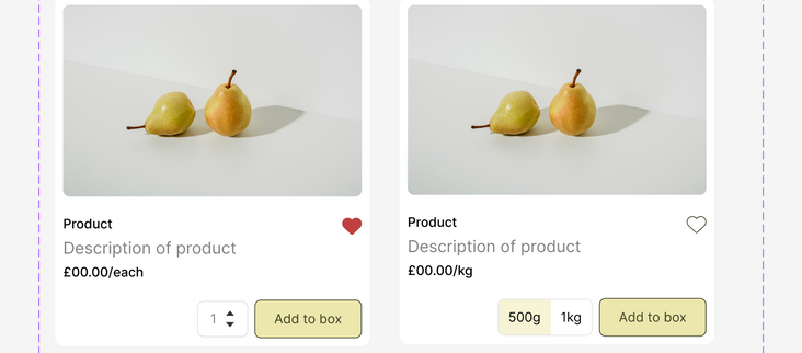
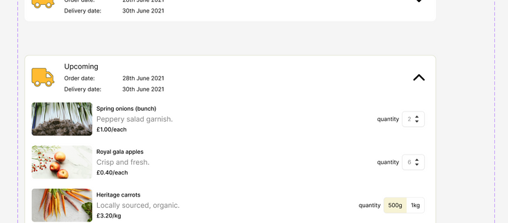
This simple site only needed a handful of components:
-
Buttons
-
Generic page sections - header, footer, info boxes, toasts
-
Cards - items in the shop (with multiple variants), items in the shopping basket
-
Icon set
-
Form inputs
-
Mobile variants of these where needed
I added a few special touches, like a custom 'lemon' glyph which appears in a few places in the design, including a wait spinner. Some examples of components from the project are shown below. These all take advantage of Figma's variants system to make the prototyping process more flexible and efficient.
Prototypes
The business owners wanted to be able to share prototypes with some of the customers to get their feelings. So, once I had designed the site I recorded a couple of flows, one for each of the main ways of starting an order. Videos are below.
During the design, I added in one feature we'd mulled over during ideation but hadn't made a priority - a section of "Jo's top picks" on the front page. It balanced the layout and provided opportunities for upselling.


Mobile access
At the same time I looked at how the website might work below the mobile device breakpoint. Because of the nature of the site, I wasn't convinced that simply using a responsive grid would give the best user experience, so I briefly explored a mobile-specific version of the site, to be loaded when smaller resolutions were detected.


So, what happened next?
Jo and Mark were very happy with the designs, but sometimes unexpected barriers get in the way of delivery. In this case, the downturn in economic forecast in the UK a couple of years ago made it impossible for the business to raise the capital required to invest in a full website build, and the project was put on hold until business was more stable.
We still hold out hope of continuing the project, but even if that doesn't happen, it was a valuable opportunity for me to be the lone researcher, designer and deliverer of the product design.


